Recko
Reconciliation
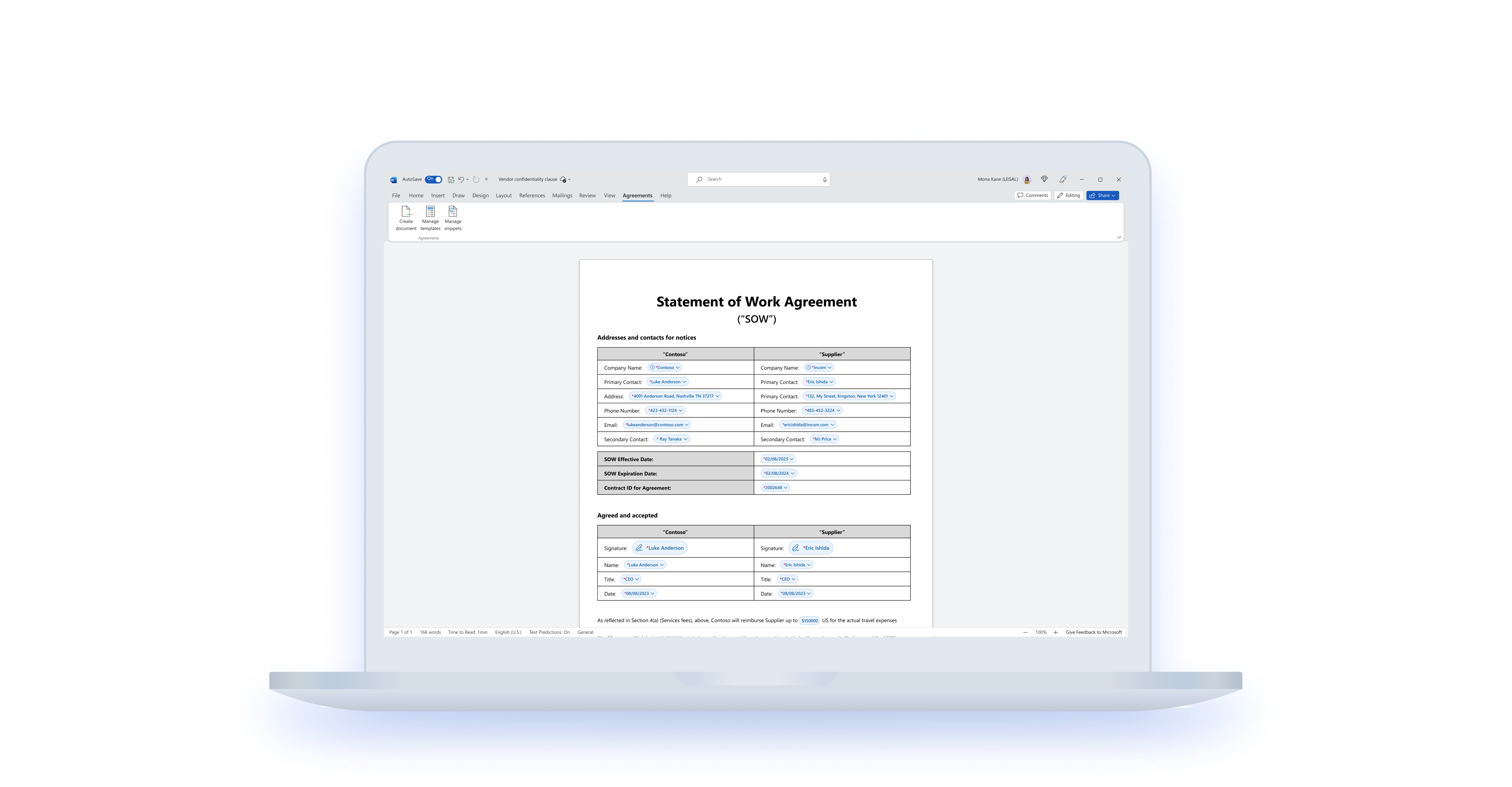
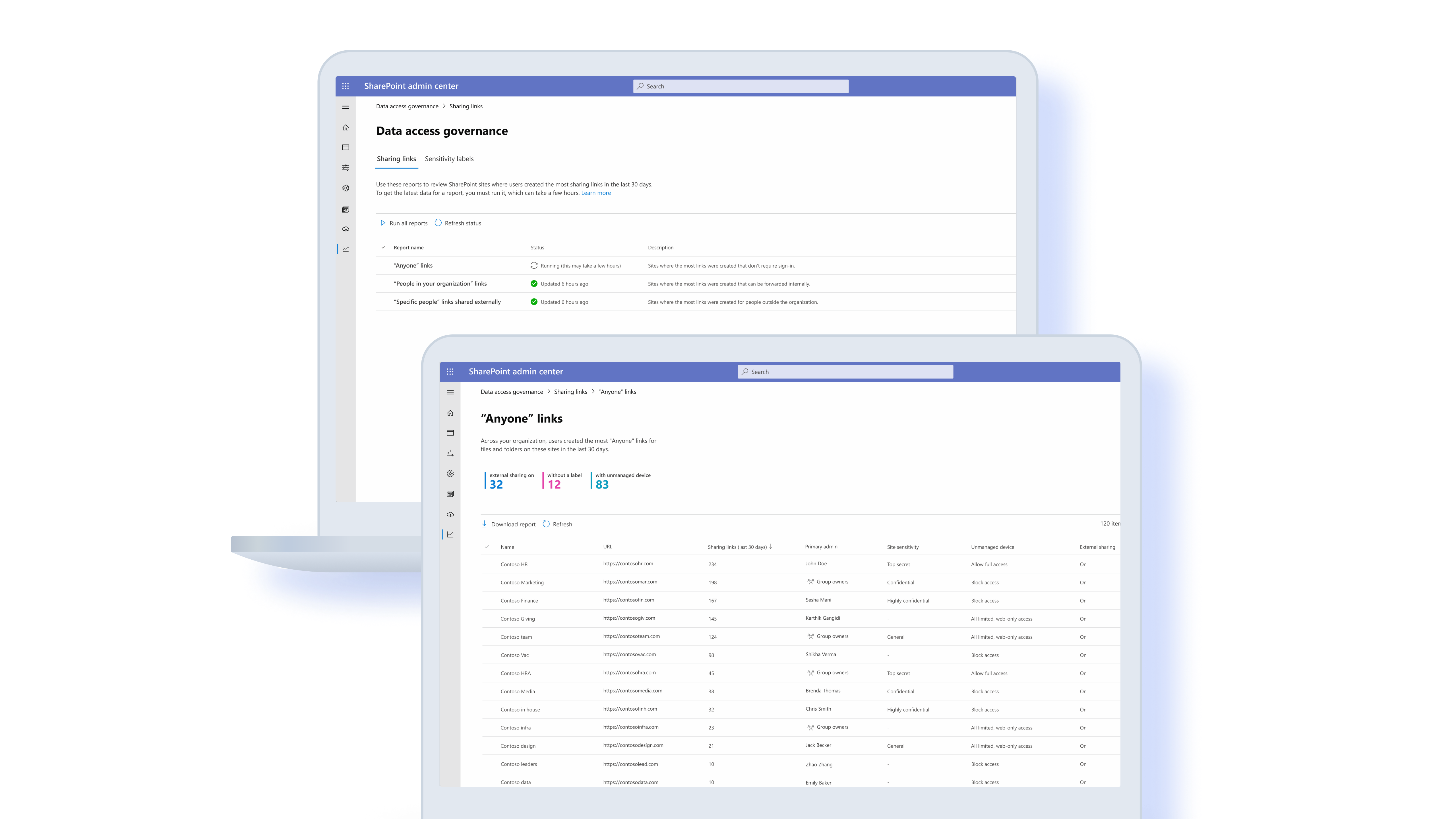
Dashboard

During my time at Recko, a fast-scaling fintech startup now acquired by Stripe, I worked on a bunch of interesting and complex experiences. This included approval flows, transaction lifecycle search and a wholesome analytical dashboard used to track payment reconciliations. This is a case study of how we designed the dashboard which was shipped in early 2020.
ROLE
Product design, Data visualization, Research
TEAM
Solo designer, 3 engineers
DURATION
Nov '19 - Jan'20
Understanding Recko
Recko is a SaaS-based transaction management platform that enables AI-Powered reconciliation of digital transactions & keeps track of the complete transaction lifecycle for organisations.

The
Dashboard
The idea behind building a dashboard was to give our customers an overview of the health of their payment transactions, and give them insights to dive deeper.
The design process

Use cases
Wearing PM hat to define use cases
In the absence of a dedicated PM, I had to identify the necessary use cases that would go into building the dashboard. Here is a detailed overview of what that process looked like.

1. Leveraging internal wisdom
I tried to leverage as much internal knowledge as possible. The business analysts spent the most time interacting with customers — by onboarding them to the product, helping them mitigate issues or simply keeping a track of their needs. I sat down with the business analysts and the founders themselves to map out the entire reconciliation flow and eventually find out points of interest.

User recon lifecycle
2. Looking at best practises
We did a comprehensive audit of other reconciliation tools. This helped us define minimum competitive benchmark or table stakes. Some of the top scenarios we discovered in compete included highlighting reconciliation status (with a focus on open items), ageing summary and any defiance from SLAs.

3. Scouring through real data
When our customers didn't use Recko, they used the good old Excel. A typical reconciliation at the end of the quater required 5-6 financial analysts with their nails dug deep in spreadsheets for days at end. What did they do? What were they calculating? Can we learn something from them?

User Research
Co-designing with customers
In the absence of any researcher, and having limited time and resources at hand. I had to initiate, plan and maximize my time with users. I did this by asking users to build their own dashboard using paper cutouts of the visualizations. Using a design probe here greatly elevated the discussion and helped us maximize our time with users.


Putting it together
Rating and finalizing the use cases
After identifying all possible use cases, we devised some parameters that would help us narrow down key use cases to show on the dashboard — Frequency of use and Impact. We later also matched the finalized use cases with the potential visualization treatment it should receive, which was further explored in the design iterations.

Designing the Viz
We scrabbled through many iterations using pen paper as well as digital mediums to finalize the vizzes. We relied on internal validation from the team to eventually narrow down from a range of iterations. An important step for us here was also to validate the visualizations with real data.
1. Pen, paper and pixels
Early sketches

Early mocks

Final mocks

2. Testing with real data
An important part of the iteration process was to validate the iterated viz forms with real data. I used Tableau to play with a variety of real data sets from different orgs to test the fittingness of the proposed visualizations.

3. Visual design
The typography and UI components used in the dashboard were borrowed from our existing design system. The one segment that was missing was a definitive colour palette for the dashboard. We worked on converting our product brand colours into a viz appropriate colour palette so that the final dashboard appeared cohesive and seamless.

Final
Design
The final step was putting together all the individual sections together in the dashboard. Every dashboard tells a narrative and our's was a function of impact as well as the frequency of view of its visualizations.

Selected works